Ani Yogurt
Branding Services / Packaging design
industry
Food, Dairy, Yogurt
client
Ani Product
year
2021
awards


overview
Our partner approached us to brand their new product - yogurt with fruit, which would join the “Ani Product” family.
challenge
The challenge was to create the brand with its own independent identity, yet still resemble the parent imagery, where accumulated benefits of the parent brand would continue to transfer to this new product.
solution
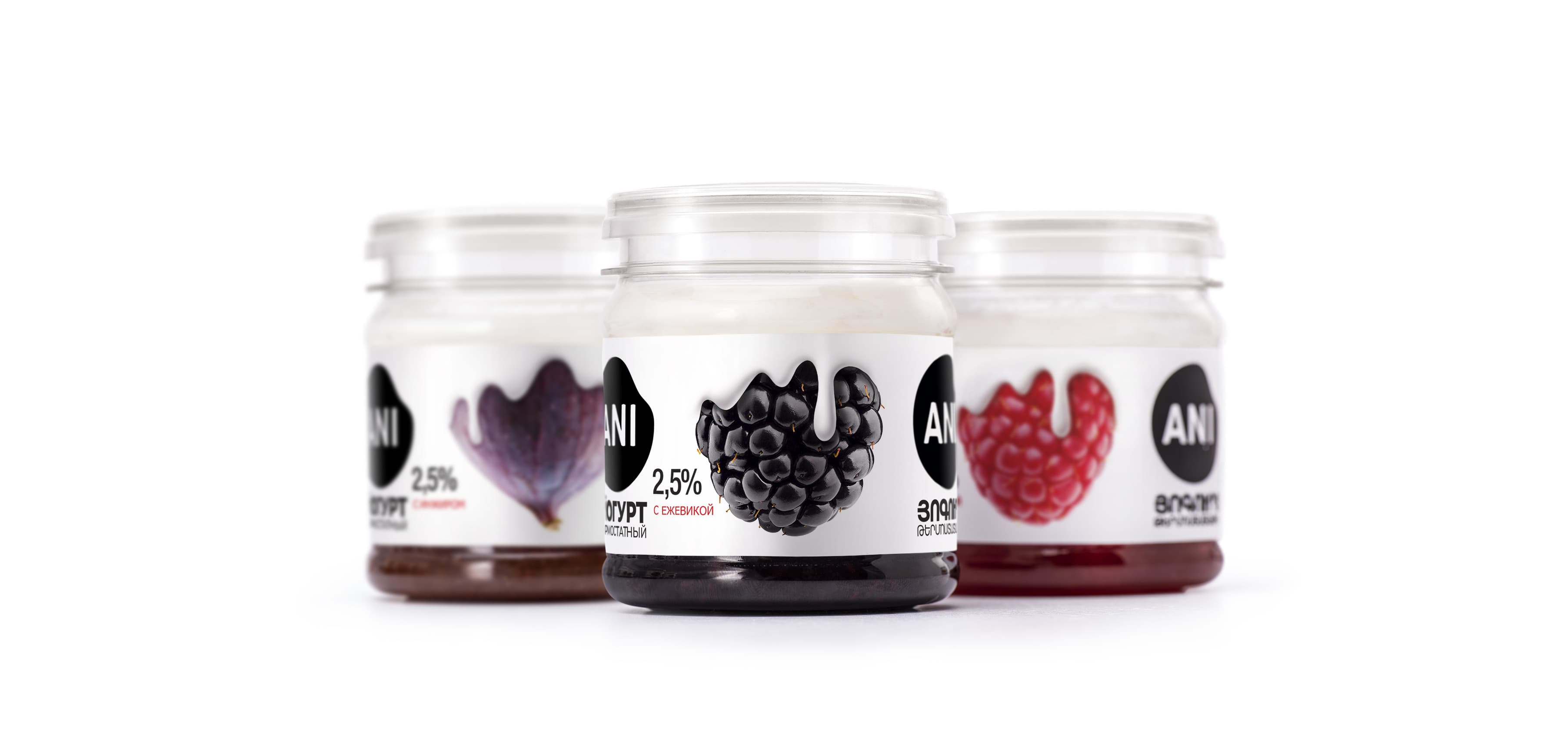
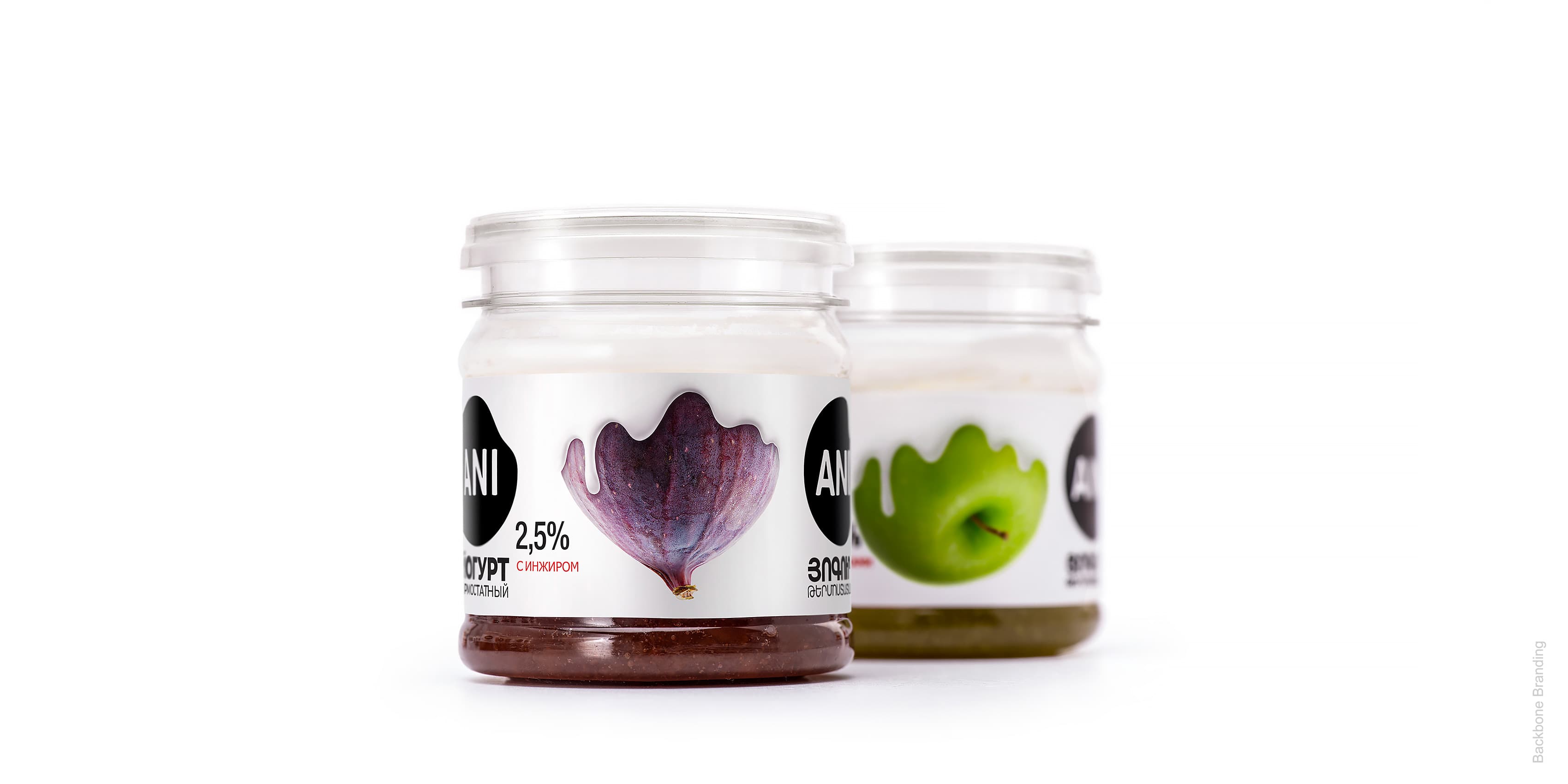
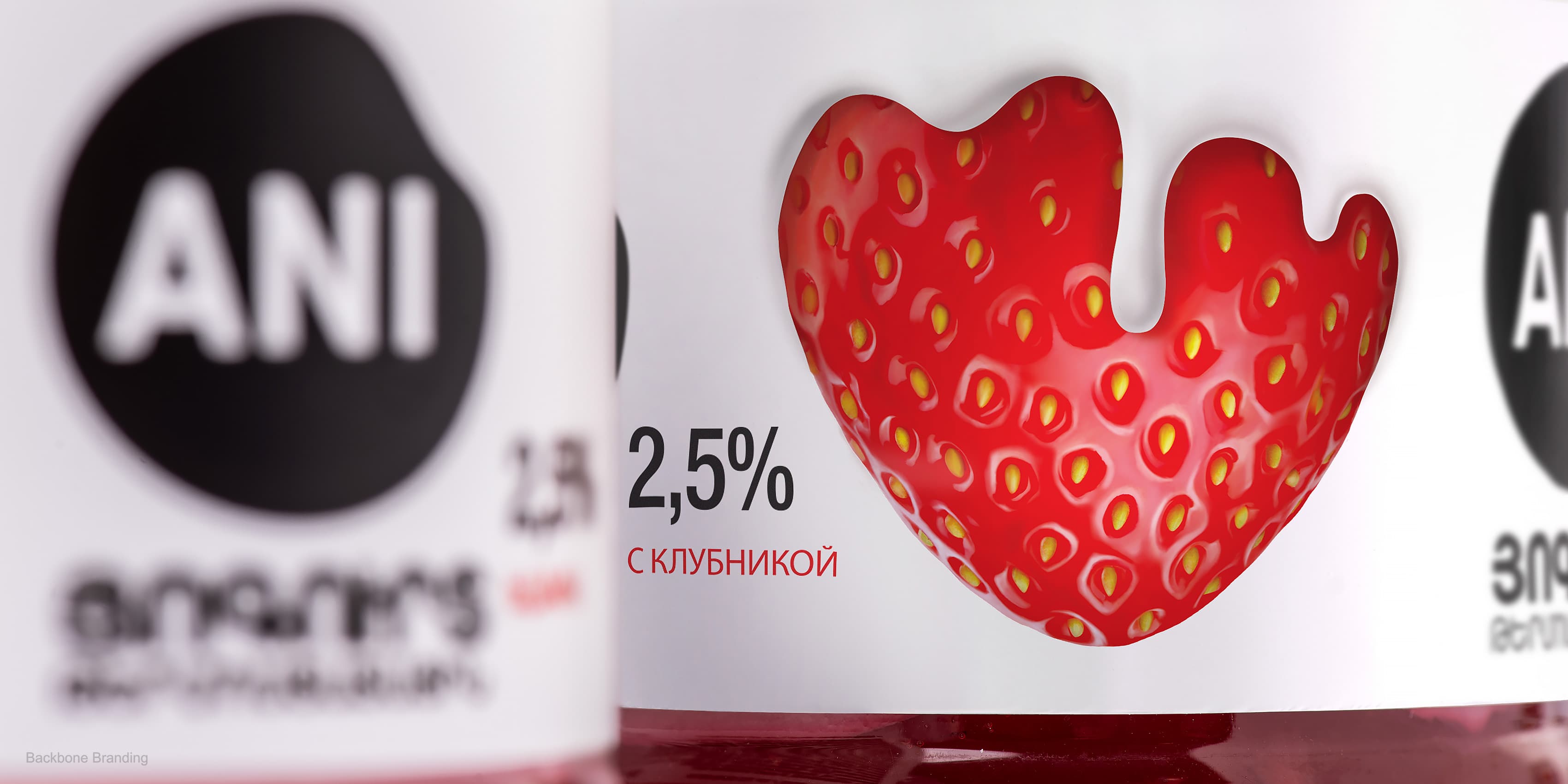
The design is minimalistic, straightforward, and not overloaded with text and images. It is attractive, rendering a natural and delicious product, representing the ingredients in all fairness. The contents are clearly visible through the transparent jars.
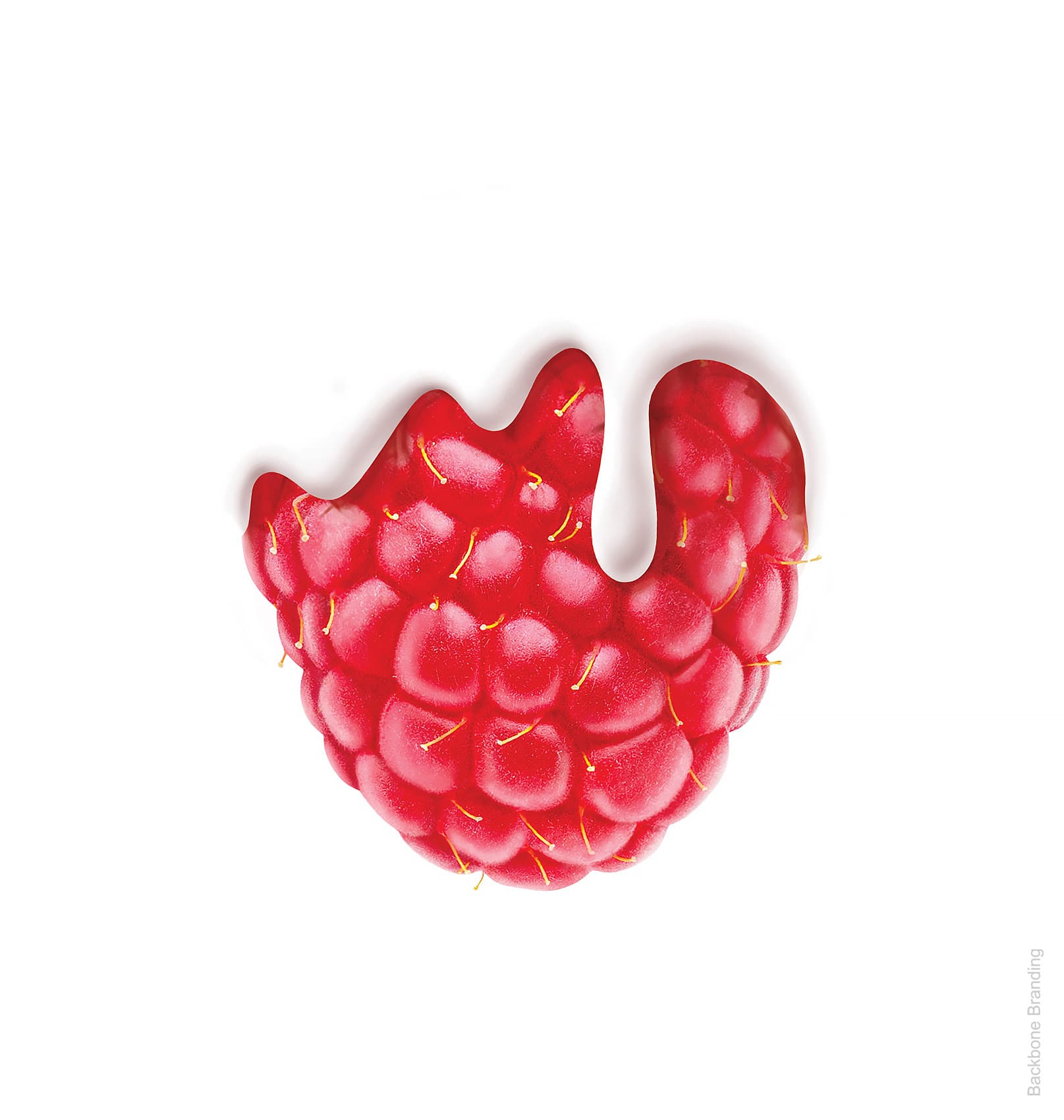
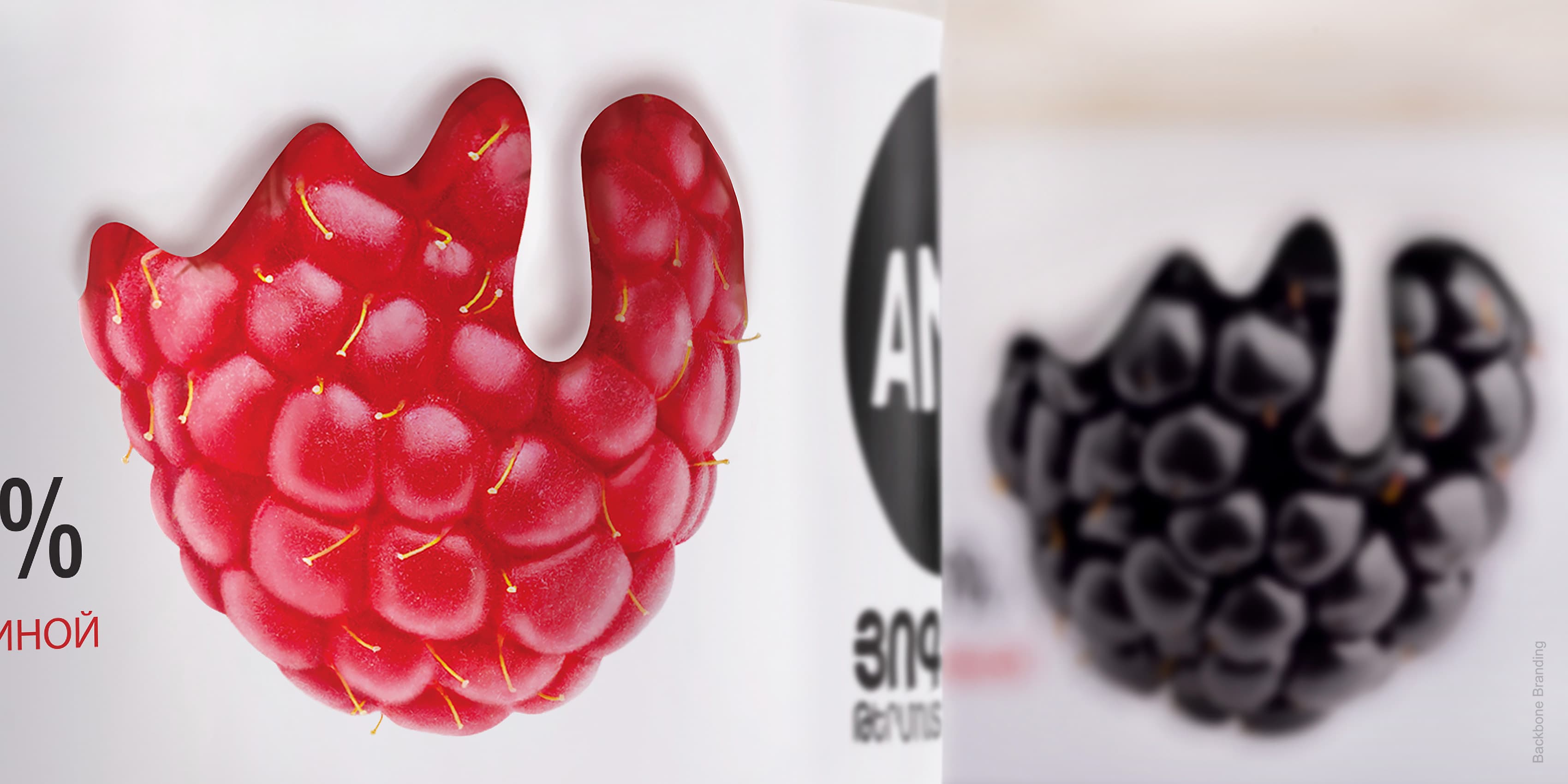
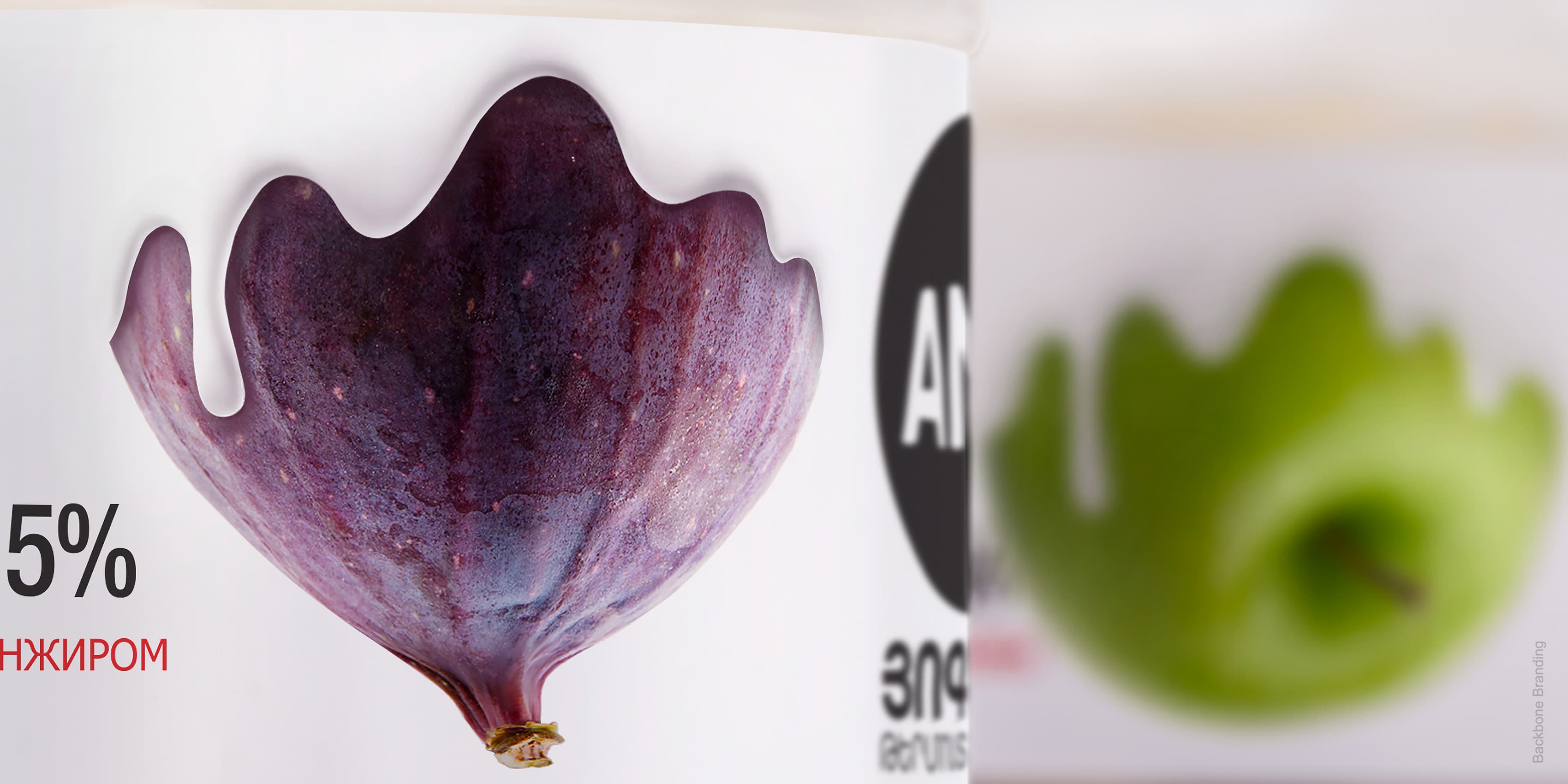
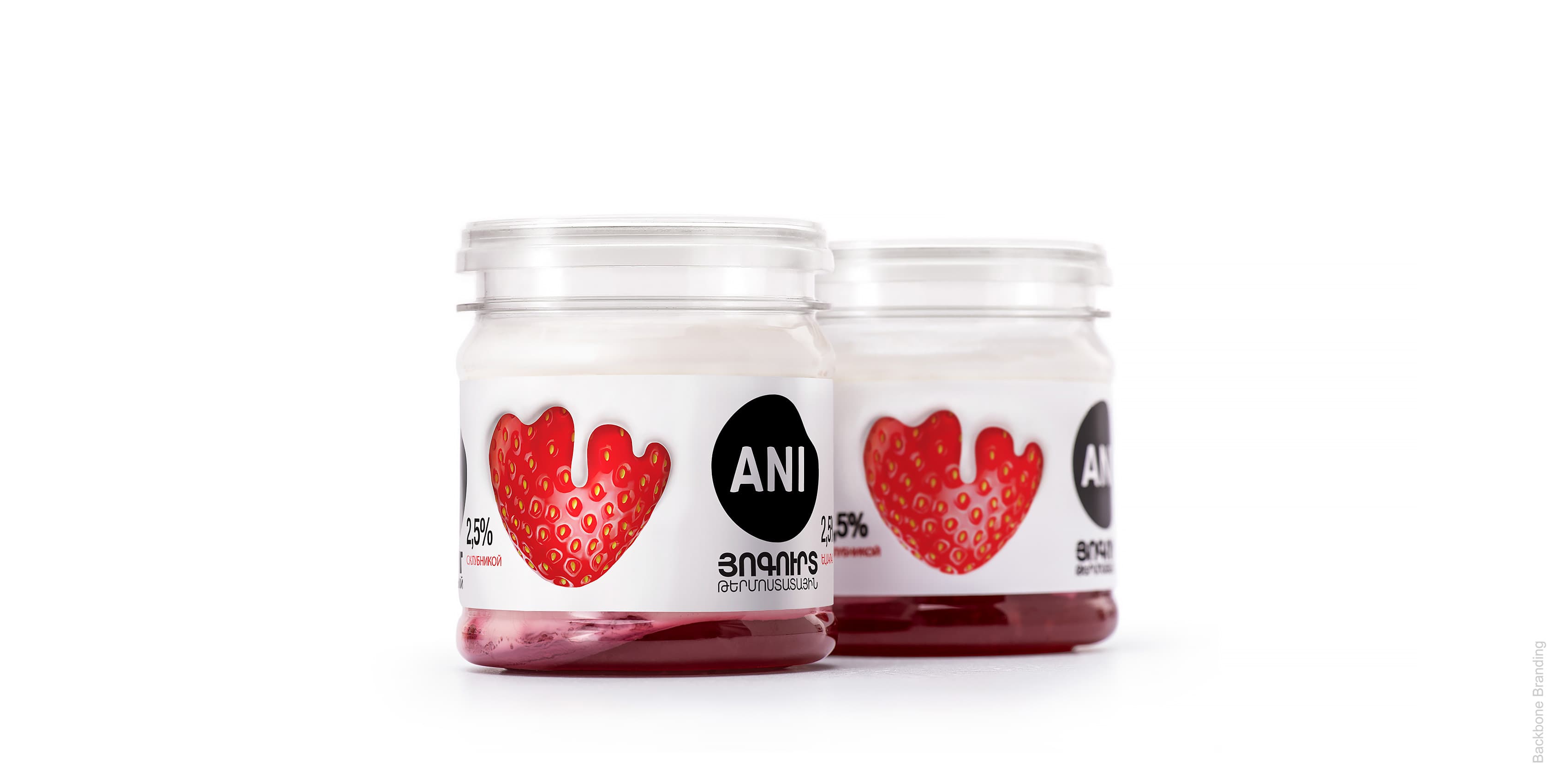
The life-like fruit on the packaging showcase the fruity layer at the bottom of the jar, and the natural yogurt made from pure, full-cream milk compliments the rich colors in a cloak of tender, creamy goodness, ready to be devoured. The product logo, which we previously redesigned, is a simple black spot - a bold nod to the spot on the cow’s hide. The logo is printed on both sides of the packaging, which makes it visible on either side of the shelf, garnering a greater impact on consumers. The end result: A simple design, creating an emotional connection with customers, joining the “Ani Product” family, loved and sought out on the shelves.
Click for more
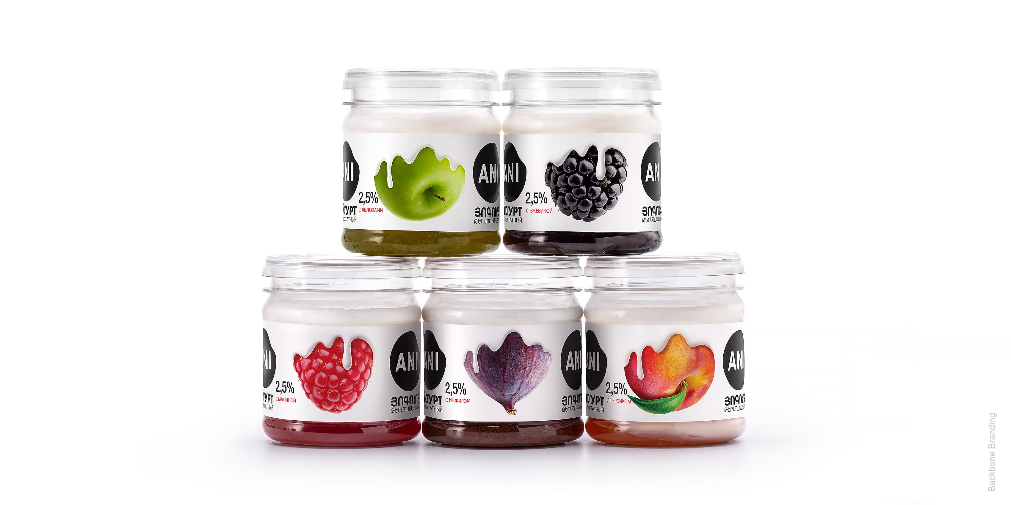
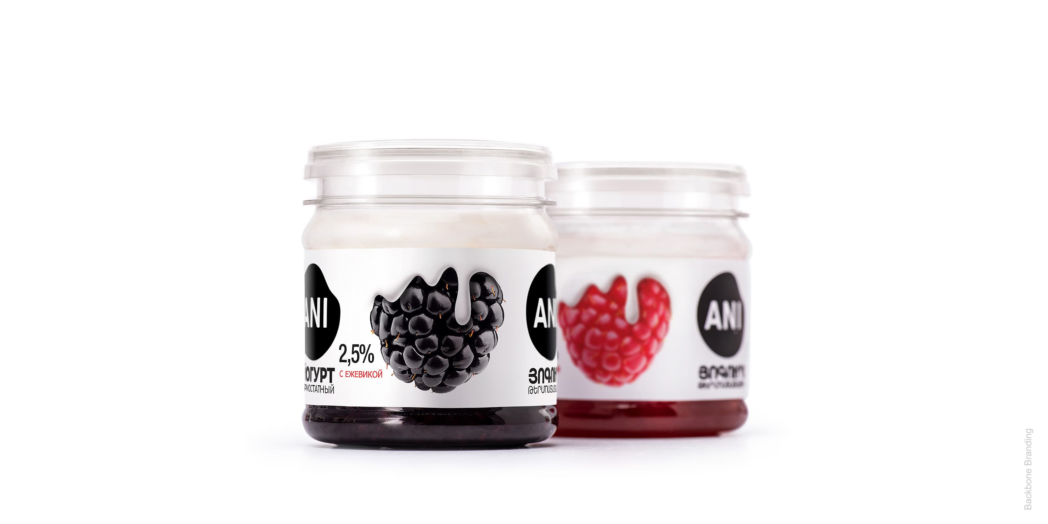
The life-like fruit on the packaging showcases the fruity layer at the bottom of the jar, and yogurt compliments the rich colors in a cloak of tender goodness, ready to be devoured.
The logo is printed on both sides of the packaging, which makes it visible on either side of the shelf, garnering a greater impact on consumers.
This packaging design is super clear to any consumer as to the content and taste of the product. It looks clean, natural & tasty. The drops coming down the fruit alludes to the texture of the yogurt. The fact that the ingredients are visible at the top and bottom gives credibility and transparency to the content. It's brilliant.

Monica Holmvik Persdotter
Global Category Director at Arla Foods
More works